
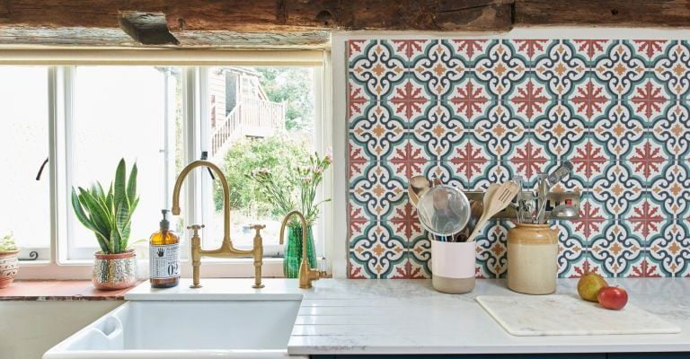
Designing your interiors is a fun process, wherein you work on personalized elements in shaping your lifestyle. Small decisions, like the right color for your kitchen splashback, will alter your house’s overall appeal. Glass splashbacks are luscious to look at and a maid’s delight as well since they are easy to scrub and clean. Besides, these splashbacks with sleek finishes make the interiors vibrant.
That said, there are too many options in the market right now, which is why we think our guide is a must-read.
With too many color and design ideas to choose from, you would find it easy to land up in a dilemma. Thus, this article will guide you on the right way to choose the splashback colors for your interiors.
Why should you prioritize choosing the right splashback color?
Among all the visible elements in your kitchen, the splashbacks happen to be one of the most conspicuous ones. These integrations can pull together the entire look of your kitchen by decluttering the stuff from your kitchen into an outdoor storage room. To optimize this visual appeal, it makes sense to choose the right color for your kitchen splashback. With the right color for your splashback, you would also maximize the amount of light in your kitchen. Altogether, this would enhance the visual appeal of the interiors. In case you are unsure which color you should go for, it would be wise to seek professional support.
Choosing the right colors for your splashback
Here are certain approaches that would make your splashback color look outstanding.
1. Aim to complement other colors
As a homeowner, it makes sense to choose a complementary color for your splashback that would blend seamlessly into your kitchen. This implies that the color should go well with other accessories and the interior.
However, it doesn’t indicate that you need to choose the same color for the splashback as your walls. With expert guidance, you can choose a color that would beautifully complement the surroundings. A calculated approach in this regard will make your kitchen vibrant.
2. Neutral shades work fine
When it comes to comparing splashback colors, you cannot possibly overlook neutral shades. These colors happen to be one of the most vibrant ones. Elegant and timeless, neutral splashbacks can go well with the existing hues of the kitchen. Moreover, these colors wouldn’t make the interiors too overbearing.
However, neutral colors don’t necessarily mean white. In fact, if you explore the entire suite of the neutral spectrum, you have several picks like creams, greys, duck egg blue or muted greens. Even some of the darker shades like navy can work perfectly for your kitchen splashback.
3. Go for mirrored splashbacks
Many modern homes have mirrored splashbacks in the kitchens. With reflective surfaces, you can enhance the essence of spaciousness. However, when you have limited space, mirrored splashbacks would add a new dimension to your kitchen. Installing something reflective on the surface in a small area boosts the feeling of spaciousness.
Most importantly, you would love the additional room for customization when you settle for mirrored splashbacks.
4. Check the existing color scheme
In case you are renovating your kitchen, you need to choose the right color for your splashback. When you want an elegant shade for the splashback behind the stove, consider all the colors that would go well with your kitchen. For instance, if the overall tone of the walls is somewhat earthy, you can create a contrast by choosing a black or white splashback.
On the other hand, some Australian kitchens have bright shades in the kitchens with terrariums and colorful cabinets. So, you might settle for colors like yellow or blue so that they can balance each other. However, ensure that the color you choose makes the splashback stand out so that the appliances do not blend too much.
5. Prioritize your practicality
Sometimes, you need to think beyond complementing colors or simply your favorite ones. When you evaluate the shade of your kitchen splashback, you need to consider elements like food spills, grease, or drink spills from time to time. With darker shades, you would be able to hide these stains for a longer time. Prioritizing practicality, you might decide the color of your kitchen splashback.
6. Consider future plans
When you remodel your kitchen, choosing the right color for the splashback turns out to be a crucial decision. Particularly, when you have guests, they tend to look at the splashback whenever they are near the kitchen. So, you must be serious and meticulous when choosing the right shade for your splashback. In this regard, you also need to consider your future plans.
It would be a logical decision to use neutral shades like black or white in case you want the splashbacks to go with any color scheme in the future. Besides, these colors go well with most modern designs in kitchens. Therefore, you may choose a muted or neutral tone for your splashback.
7. Consider the space in your kitchen before choosing the splashback color
Before you start comparing different viable color combinations in your kitchen, including the splashbacks, consider the size of your kitchen. For small kitchens, you shouldn’t go for dark splashbacks. If you are fascinated with black countertops and splashbacks, you need to have a large space. Otherwise, the dark color will absorb light. This would lead to a compromise in the essence of spaciousness.
Likewise, excessive white elements in the splashback would not look too appealing, particularly if you have a large kitchen. So, you need to consider your kitchen size before exploring the possible color palettes.
Endnote
You need professional knowledge and aesthetic sense to shop for a kitchen splashback. It would be wise to consult the experts who specialize in customizing kitchens. Considering the looks of all your accessories, including sinks, door knobs, internal drawers, and other elements, they would guide you professionally in choosing the color.
Besides, you may convey your budget to them for a more personalized quote. This ensures you can choose the most balancing color scheme for your splashback. At the same time, you can keep it ready for future modifications in your interiors.


Comments